Cloud PC Health & Monitoring
Before this, admins couldn’t tell if a Cloud PC was healthy at all — let alone spot the pattern across a fleet of thousands, or know where to act first. The fix was a three-step model — Signal, Aggregate, Act — turning per-device noise into a fleet-level view an admin could actually act on.
- Role
- Design Lead, monitoring/reporting strategy & Design Owner, Frontline/Flex — with a prior AVD background
- Scope
- Fleet-scale monitoring — signal aggregation, dashboards, restore
- Outcome
- A unified reporting dashboard, adopted across Cloud PC and Flex — one shared reporting model rather than a per-signal, per-device pile of reports
A Cloud PC is a virtual machine an admin can’t walk over and look at. When something went wrong — a bad connection, a corrupted profile, a region outage — there was no established way to see it coming, understand its scope, or fix it without a full rebuild.
And every signal that told an admin something was wrong arrived one device at a time — one Cloud PC’s connection failed, one Cloud PC ran slow, one license was about to run out. That doesn’t scale as an admin experience once a tenant has thousands of Cloud PCs: nobody can review devices one by one looking for the ones that need attention. Windows 365 needed a way to turn per-device signal into a fleet-level picture before it could earn trust as a real alternative to a physical PC.
The earliest version of this problem showed up before Cloud PC even had its own reporting: getting basic service health onto the console home page at all meant building a pattern generic enough to extend to any future service, not just this one. That reusable health pattern became the seed for everything that followed.
The second finding was that raw signal isn’t the same thing as an actionable view. Performance data, connection failures, and license usage all arrived as per-device facts, scattered across whichever team happened to own that signal. Before I could design a single dashboard, I had to work out how those device-level facts rolled up into something true at the tenant level — the design problem wasn’t the screen, it was the aggregation underneath it.
Reporting requirements arrived scattered — performance, connection failures, license usage, device action status — each from a different stakeholder, each describing its own signal on its own device.
A report per signal, per device
Each new monitoring need could have shipped as its own isolated report, showing the raw per-device data that prompted it. That’s also how admins would have experienced it: a growing pile of disconnected reports, none of them answering “is my fleet healthy” without being read one device at a time.
Tenant-level dashboards, grouped by intent
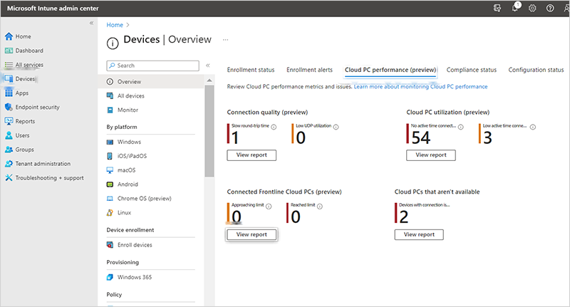
Raw per-device signal rolls up into tenant-level reports, and related reports get grouped into dashboards — Cloud PC performance, Flex Cloud PCs — so admins reason about fleet health in one place instead of hunting across separate, device-by-device screens. The pattern was built to scale to whatever monitoring need came next, not just the ones already requested.
Connection failures and license-usage gaps surface at the tenant level first — how many Cloud PCs are affected, how widespread the problem is — with a path to drill down into any single device, rather than starting from the device and hoping to spot a pattern.
Signal, Aggregate, Act
How thousands of individual Cloud PC signals become one dashboard an admin can act on.
Signal
Each Cloud PC reports its own connection quality, performance, and license usage — one device at a time.
Aggregate
Raw per-device signal rolls up to a tenant-level view — admins see patterns across the fleet, not one device.
Act
Grouped into dashboards by intent, not by which team owned the signal — performance, Flex, connection health.
The design problem was never the dashboard screen — it was working out how per-device facts scattered across teams rolled up into something true at the tenant level. Aggregate is where that decision lives.
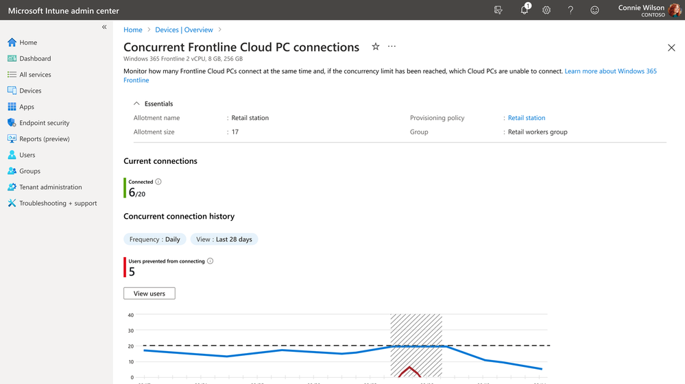
Flex — formerly Frontline — Cloud PCs needed a different kind of signal entirely, and this is where owning the shared model as its own design problem mattered most. A regular Cloud PC is one person, one device, so its health question is simple: is this machine working. A Flex Cloud PC is shared — multiple people licensed against one Cloud PC, one at a time — so the real question isn’t about any single device, it’s whether the shared pool is keeping up with demand. I designed a report showing concurrent license usage and which users couldn’t connect, so admins could see actual utilization against capacity and decide whether they needed to license more Flex Cloud PCs — a capacity question the per-device model this page is built around doesn’t answer on its own.
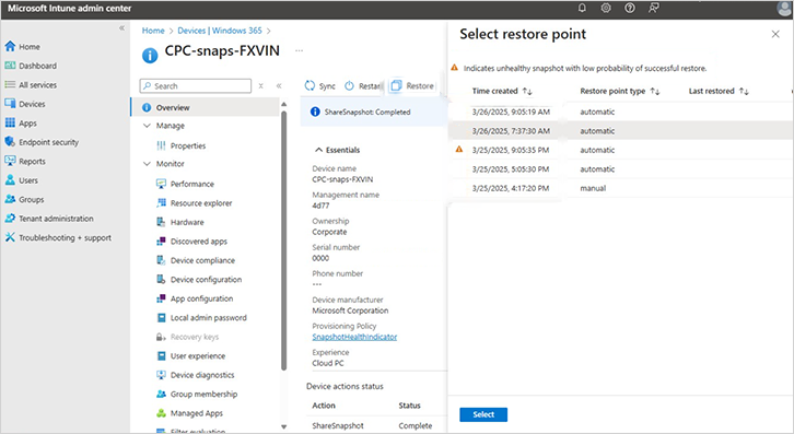
Restore and repair live inside that same fleet-aware model. Restore lets an admin roll a Cloud PC back to a working point in time without a full rebuild; a compliance-focused restore point can be shared directly with forensic investigators, built as one shared framework since both are the same underlying capability for two audiences. Naming mattered too — I partnered with content design on “Attempt to repair connection” instead of the more obvious “Troubleshoot,” since Troubleshoot already meant something else elsewhere in Intune.
Those same actions needed to work at fleet scale, not one device at a time. I designed bulk-action workflows with batching underneath — an admin filters down to the Cloud PCs that need something, then acts on all of them at once, and the system works through the batch reliably instead of the admin repeating one action thousands of times by hand.
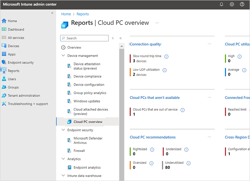
Shipped Windows 365 management experiences, published by Microsoft — learn.microsoft.com/windows-365, report-remoting-connection, and report-connected-frontline-cloud-pcs. Reference for the shipped admin surfaces.
Building a generic aggregation pattern — one that could roll any future per-device signal up to tenant level — cost more upfront design and engineering time than shipping each requested report as its own one-off screen. It paid off every time a new monitoring need arrived afterward, since it slotted into an existing model instead of becoming its own bespoke report.
Designing restore and eDiscovery as one shared framework, instead of shipping the compliance ask as its own bolt-on feature, cost more upfront alignment between two PMs who’d never planned to work together. It paid off every time a new restore-point capability shipped afterward, since it only had to be built once and it served both audiences.
Cross-region disaster recovery meant designing for a scenario most tenants would hopefully never hit — a full regional outage, industries like financial services, government, and healthcare needed to plan around regardless. I designed the admin path to move affected Cloud PCs to a healthy region and back once resolved, for a workflow most admins would use rarely if ever.
The unified dashboard pattern didn’t stay scoped to the reports that prompted it. I led the alignment of Cloud PC reporting updates across both the Cloud PC and Intune teams, building new data visualization and one unified dashboard for reporting that both teams adopted going forward — not a one-off report, a shared reporting model. This monitoring, reporting, and alerting strategy was explicit, ongoing work I owned across the full arc of the product, not a single shipped feature.
Before Windows 365, I worked on Azure Virtual Desktop — that background is part of why I was later trusted to drive the strategy for unified device management across Windows 365, AVD, and core Intune: developing the conceptual designs and presenting the coherence strategy to design and research leadership. I also mentored the designer joining the team on AVD, helping her get up to speed on Intune’s patterns; she went on to deliver the Cloud PC Copilot designs for Private Preview.
Raw signal isn’t the same thing as an actionable view — the real design work was translating per-device data into a tenant-level pattern admins could act on, not just displaying more data.
Group scattered monitoring requests by admin intent, not by which team asked for them — a dashboard organized around “is this healthy” scales better than one report per requester.
Design for the rare, high-stakes failure too — cross-region recovery mattered most to the admins who’d use it least often.