Building This Portfolio
I’m a designer, not a developer — so I designed this site and directed Claude, an AI coding assistant, to build it. AI wrote the code. The decisions were mine — the structure, the palette, the flower mark, the copy, every catch below. “Used AI” undersells what that took: nothing here shipped because AI suggested it, and when its first draft didn’t hold up, I sent it back until it did.
- Role
- Designer & director — content, visual system, and QA
- Scope
- Four pages, five case studies, a hidden design-system reference · summer 2026
- Outcome
- A shipped portfolio site, built by directing an AI coding assistant end-to-end — not by writing the code by hand, and not by accepting its first draft of anything
- Tools
- Built and hosted on GitHub (GitHub Pages, git tracking every change) · Claude for code · Figma Make for a few of the diagrams
I needed a portfolio that could carry a job search on its own — something a hiring manager could click through unsupervised, not a slide deck that only works with me narrating it. I could design every screen in Figma and hand it to an engineer to build, except there was no engineer on this project, and the site needed to exist before that hire came from wherever the search led.
So I directed Claude Code to build it — reviewing every output, catching what was wrong, and redirecting until it matched what I wanted, rather than accepting whatever came back first.
The first drafts back told me a lot about where I’d need to push, before I’d made a single visual decision.
The first version was one long page with anchor-linked sections. I wanted a real Home / About / Projects / Résumé structure instead — separate pages, a résumé that displays in-page instead of forcing a download, a home page that doesn’t try to do everything at once — and had the whole site rebuilt around that.
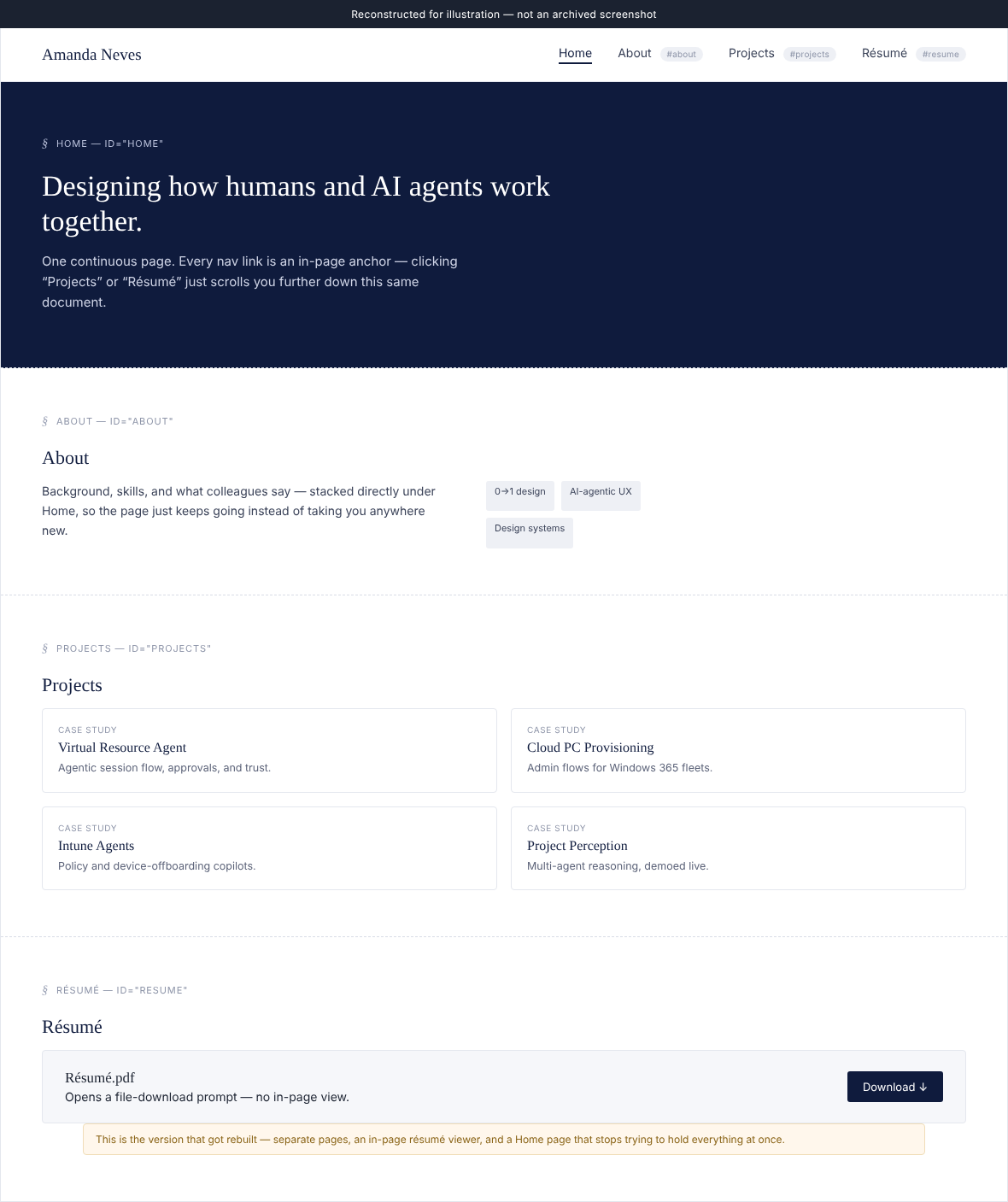
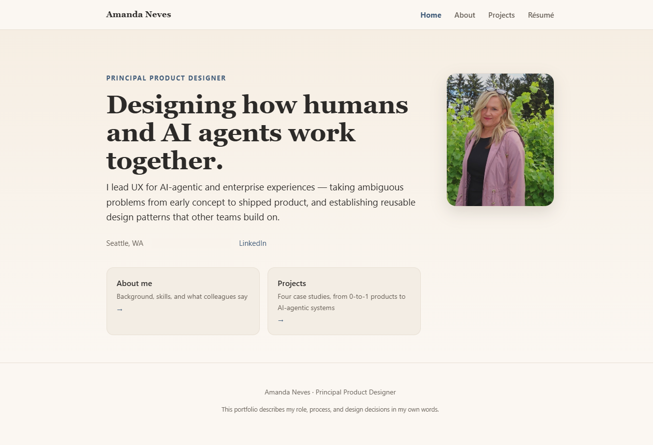
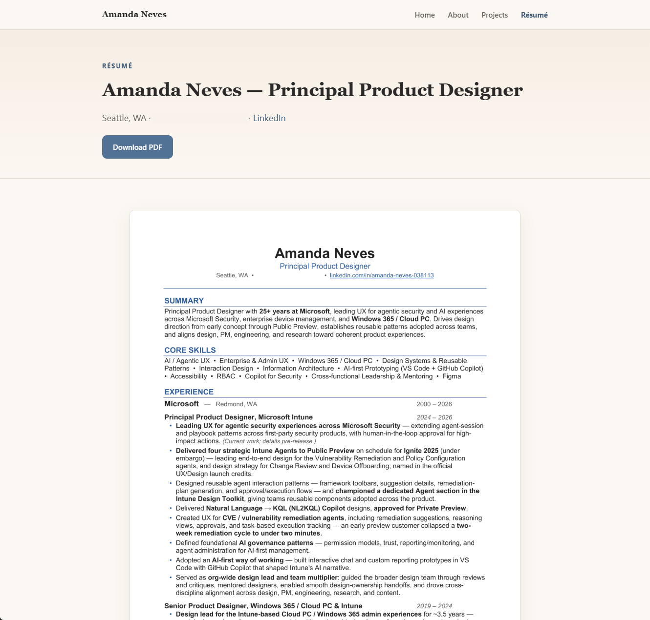
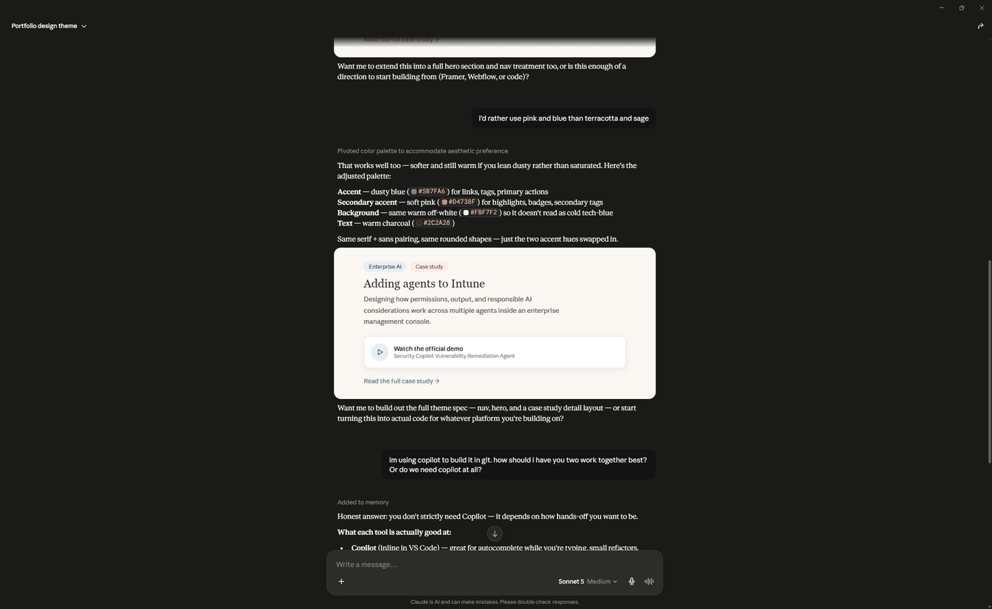
AI’s first pass at a palette leaned into a navy-and-white “enterprise software” look. I already had a warmer direction in mind — dusty blue and soft pink on a warm off-white — from an earlier design conversation, and redirected it there.
The visual identity took a full pivot mid-build, not an incremental nudge — and it happened in conversation, not by generating options and picking one.
Once I introduced a hand-drawn flower motif as a personal mark, the earlier dusty-blue/pink direction stopped fitting. Rather than just dropping in a new accent color, I had a full palette specified up front — black, white, coral, orange, cool grays — with contrast ratios checked against WCAG AA before anything shipped, so text stays legible instead of just “looking right” at a glance.

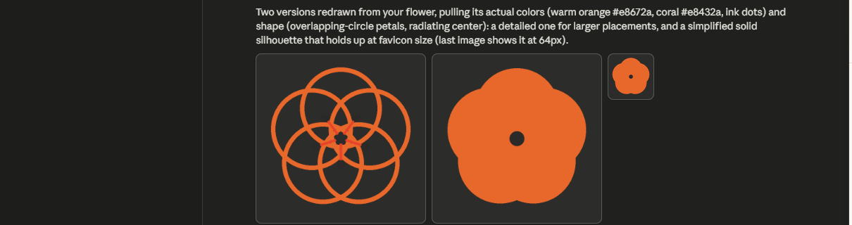
AI’s actual first attempt makes the point better than I could describe it: a rigid ring of overlapping circles that read as a geometric mandala, plus an oversimplified solid blob for small sizes — confident, polished output, and not remotely the hand-drawn mark I’d sent as reference. My note back was blunt: “This doesn’t look right. Compare this to the original EPS.”
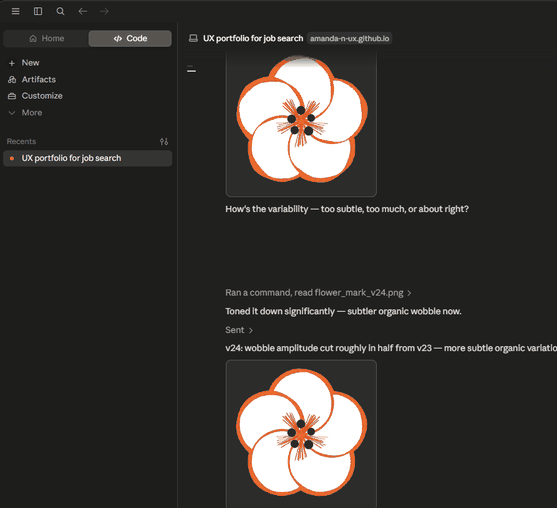
From there it took over twenty more rounds — fixing where the outlines converged, repositioning the center dots relative to the stamens, correcting uneven petal exposure — before it read as drawn by hand instead of generated. The exchange below picks up at version 24, mid-way through dialing a wobble pass back after it overshot into “too much.” It mattered more than it should have, because it’s the one graphic element that appears on every page.
Once the mark was applied everywhere, I noticed it being used differently page to page — sometimes decorative, sometimes floating oddly against a photo. I had it standardized to one placement and treatment sitewide before publishing, rather than letting each page’s version stand.
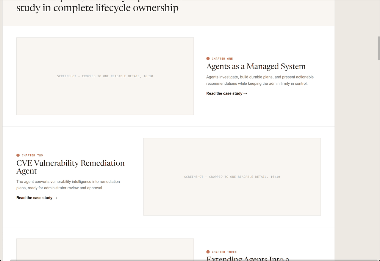
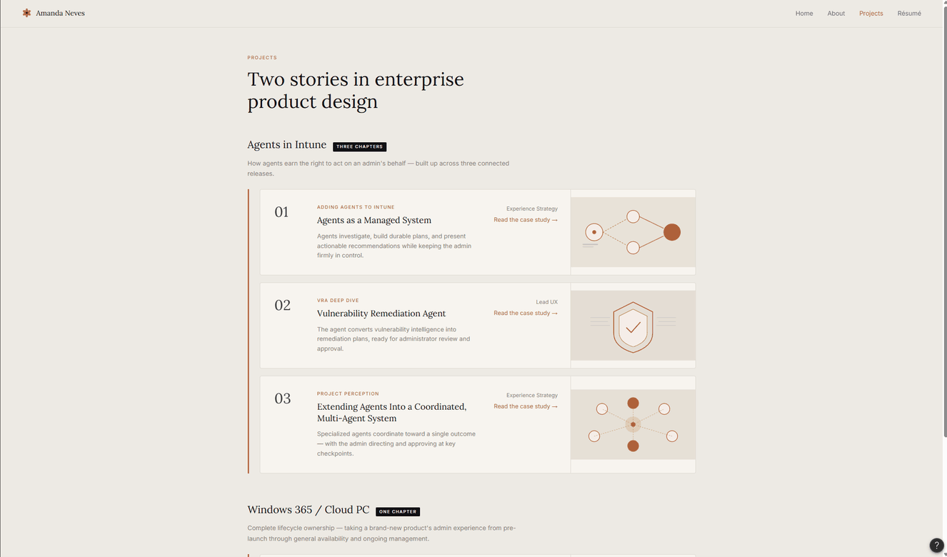
For the Projects index, I had two real options mocked side by side — a type-led index with no thumbnails, versus wide alternating rows with a screenshot per case — and picked based on which one held up with the screenshots I actually had, not which one looked better empty.
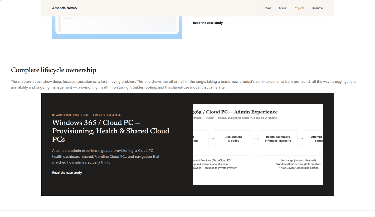
A four-page site, five case studies, and a hidden internal reference page documenting the design system itself — built on a palette and component set specified once and reused everywhere, not improvised page by page. It’s built and hosted on GitHub, so every change is tracked in git. For the process diagrams in this and the other case studies, I used Figma Make — a second AI tool — and directed it the same way I directed Claude with the code.
One pass color-coded a Problem/Role grid to visually echo a Before/After comparison above it. It looked intentional — it wasn’t. The pairing didn’t hold up conceptually, and I asked for a different pattern rather than keeping a fix that just looked finished.
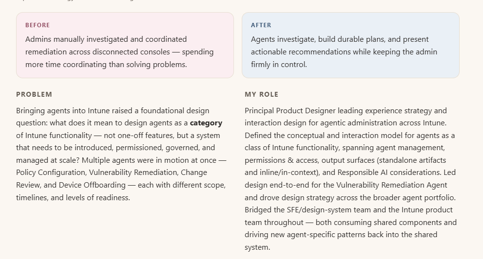
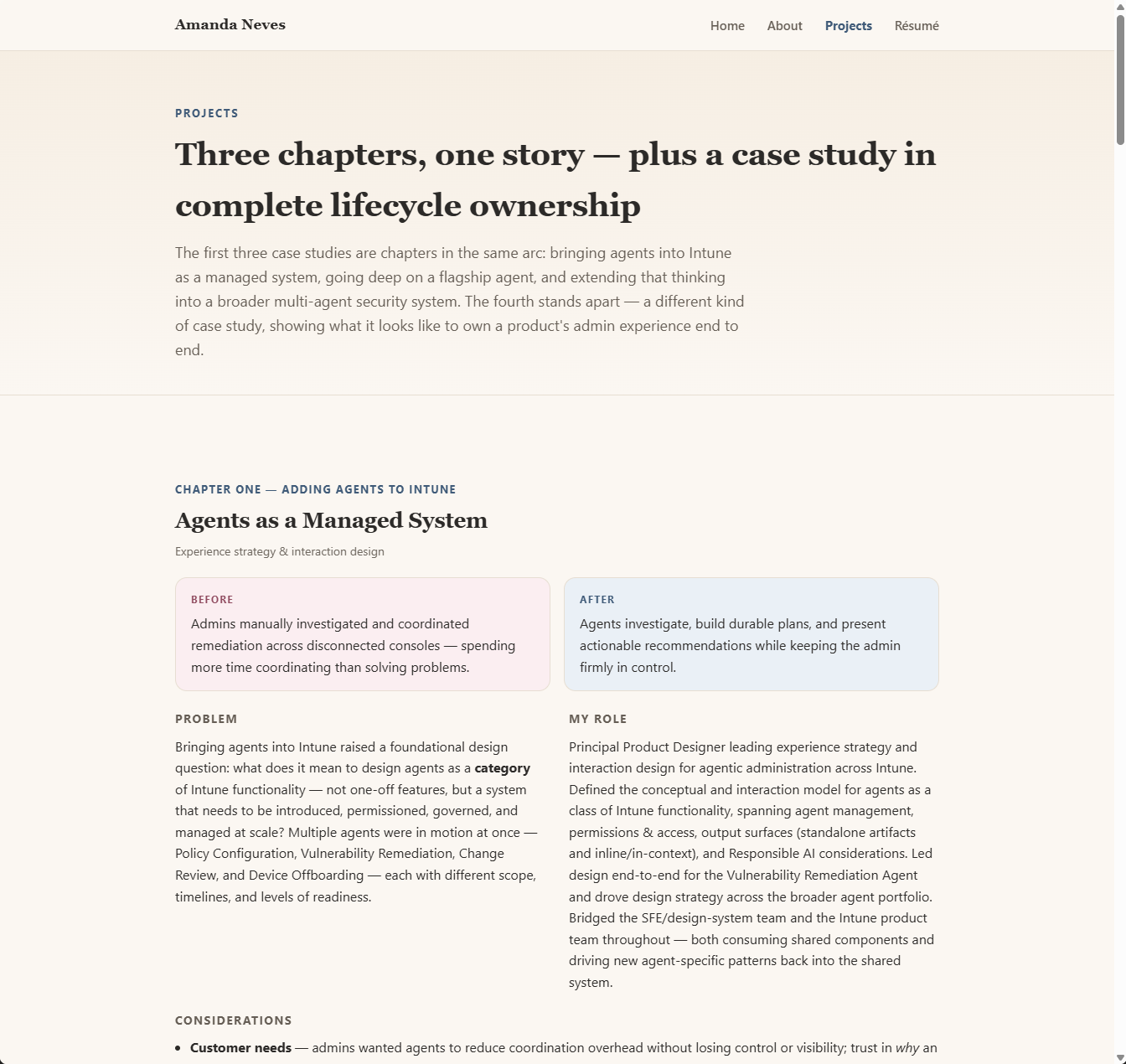
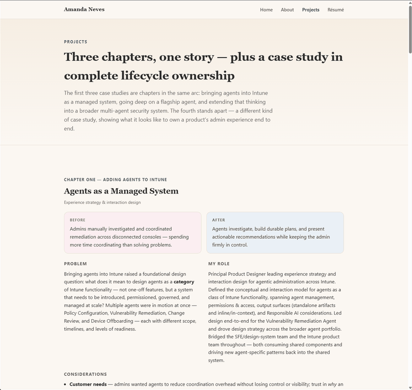
The dark case-study headers, the active nav state, and the coral accent were starting to feel like separate decisions rather than one palette. I had black standardized as the fullest expression of a color already used throughout — nav text, borders, tags — instead of a one-off dark section.
A few calls cost more time than the faster version would have — deliberately.
No phone number. Colleague feedback cited without names or dates, available on request instead. And when I noticed the résumé PDF still showed a personal email address after I’d already scrubbed it from the page text, I had it pulled before it went any further — the kind of call about what’s appropriate in front of strangers online that AI doesn’t make without being asked.
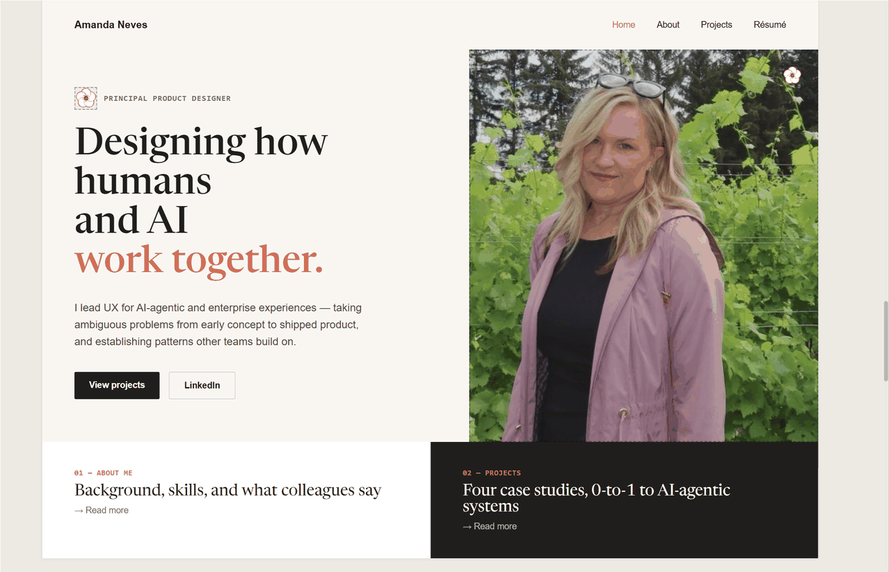
Early drafts leaned hard into AI-agent language and Microsoft-internal jargon — exactly the kind of narrow framing that can get filtered out of a broad job search. I had the home and about pages rewritten until they read as a general Principal Product Designer, with AI-agentic work as one strong thread, not the whole identity.
Home’s headline and About’s opening two blocks were all making the same “ambiguous problems into reusable patterns” point in slightly different words — reading as padding, not progressive disclosure. I had it cut to one clean statement per idea, so About’s bio leads with specifics instead of repeating what Home already said.
A portrait on the hero was an easy default to accept and a genuinely awkward one to get wrong — too corporate, too casual, or just off. I sat with it rather than shipping the first crop that technically worked.
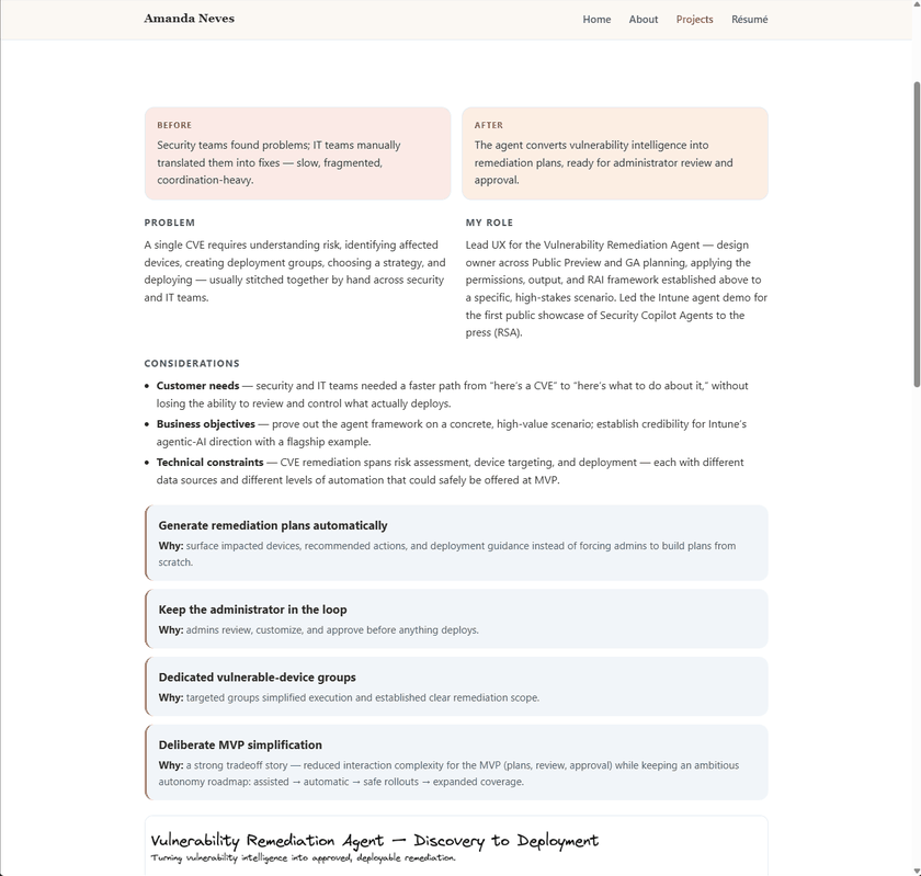
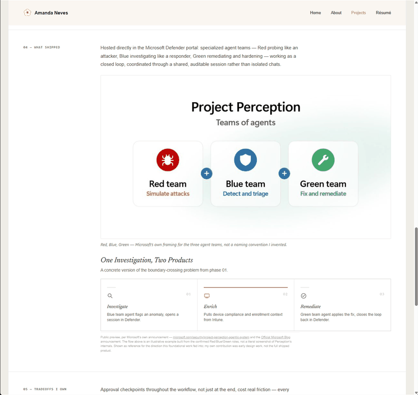
None of this shows up as a single visible feature, but it’s the part of directing AI that actually took discipline: checking what it told me before I let it stand as fact.
A caption stated a feature’s status as settled fact when it was still in preview. I caught the discrepancy, had it verified against the case study’s own framing, and had the copy corrected — a small accuracy check that matters more on a page meant to represent me to strangers than it would almost anywhere else.
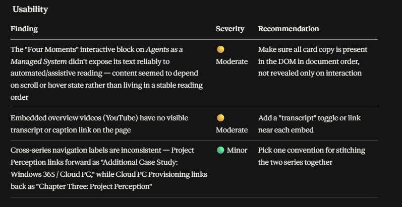
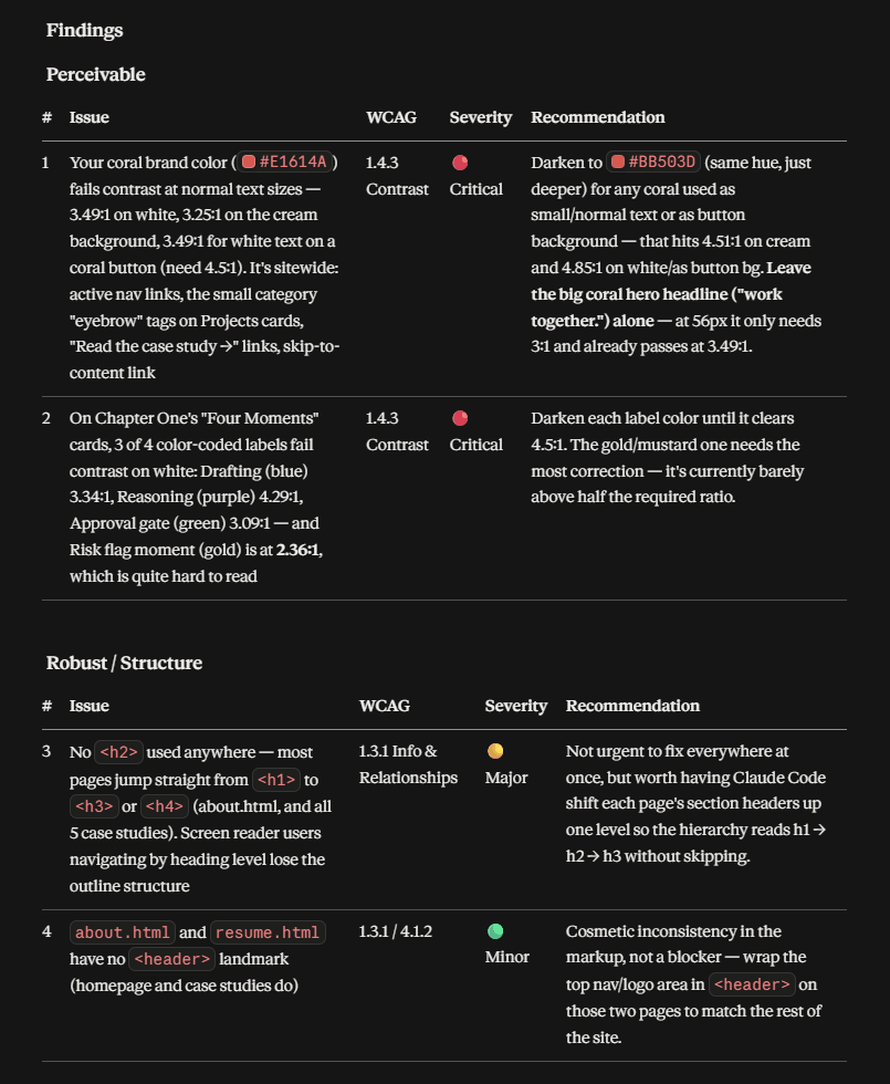
I also had the finished site checked against real usability and accessibility criteria — reading order on interactive cards, missing video transcripts, inconsistent cross-page navigation labels, and WCAG contrast ratios on the coral brand color and status tags. Several issues were critical contrast failures I wouldn’t have caught by eye.
Directing beats accepting. Reviewing an AI assistant’s output the same way I’d review a junior engineer’s PR — line by line, redirecting rather than settling — is what separated a site that looks finished from one that actually is.
Specificity earns credibility faster than volume does. Cutting a repeated idea down to one clean statement said more than three softer passes at the same point ever did.
Verify before you publish, especially your own claims about yourself. An AI assistant will confidently restate whatever you tell it — the last accuracy check on a page representing you to strangers is still yours to make.